1.2.4 - contrast tweaks
A memory of a library » Devlog
This is a small edit, inspired by watching a friend of mine play through this - there are a few places where I noticed things weren't quite as clear as I intended, so I've revised appropriately:
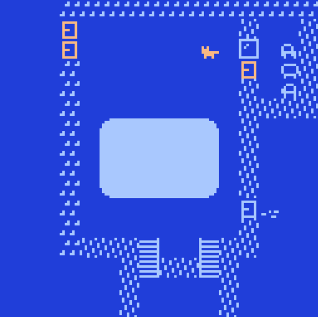
- The color palettes for the original room now remain the same between the bulk of the room and the lighted rectangle in the center - the player sprite changes color, but otherwise there's no shift. The contrast between sprite and background in the lighted rectangle isn't quite as good, but it's a small area where you don't interact with anything, so I think it's not likely to cause problems. (Please let me know if you'd rather I made the contrast better - I can do that.)
- The staircase now has some "there be floor here" tiles to hint to the player which way they should go to make it to the second floor.
- The interactable desks on the second floor now have mats on them, so it's not just color contrast distinguishing them from the rest of the desks.
There are probably other revisions I should be making to improve accessibility, but I'm hoping these will be sufficient to get most players through.
Files
a_memory_of_a_library 1.2.4.html Play in browser
Aug 03, 2019
A memory of a library
A poking-about in a representation of a building full of books.
| Status | Released |
| Author | Packbat |
| Genre | Interactive Fiction |
| Tags | 2D, Bitsy, Exploration, No AI, Pixel Art, Singleplayer, Walking simulator |
| Languages | English |
| Accessibility | High-contrast |
More posts
- 1.2.5 - additional staircase hintAug 03, 2019
Leave a comment
Log in with itch.io to leave a comment.